Jenzabar SONIS Version 3.5 Accessibility Update
Overview
In order to ensure that all students, faculty, alumni, and other users have equal access to all Jenzabar SONIS content regardless of any disabilities that these users may have, SONIS user portals have been updated based on current accessibility standards. After several months of guided changes to the form and function of the system, SONIS achieved compliance with WCAG 2.0 AA accessibility standards based on testing performed by Level Access, a leader in the field of digital accessibility.
Primarily, the changes that made were designed to accommodate people who have some kind of visual impairment along with those who use a keyboard to navigate rather than a mouse. In terms of visual impairment, many behind-the-scenes aspects of SONIS had to be altered to better conform to the needs of screen reader software. The majority of the changes made will not be visible to the typical Jenzabar SONIS user but were vital in removing barriers and granting equal access to users with disabilities.
Changes
Jenzabar SONIS Product Development made the following changes to the user portals to achieve accessibility:
HTML
One of the keys for facilitating screen reader access is having well-formed HTML. Each page in the system must have the same HTML structure with the correct tags in the correct places. With these changes in place, screen reader software can function properly and won't get lost or otherwise confused.
Tables
Tables must be formatted in a specific way to accommodate screen readers as well. Captions were added to increase clarity, blank columns were removed, and tables that were only used for alignment purposes rather than to store data were deleted. Every column heading in the user portals now has a description. These changes allow screen readers to navigate the table structure cleanly.
Labels
Labels were another aspect of the SONIS code that had to be updated. Every input field now has a label describing its purpose for screen readers. Every image was given an alt-tag that describes the image's content. Like content on each page was grouped with legends and fieldset tags added to label and describe each group. Each HTML page was given a single title attribute that properly describes the page inside of the header. Duplicate page titles were removed.
Color Contrast
One change made that's visible on the front end is the adjustment made to color contrast. Though even in this instance, the change is very subtle and will likely not be noticed by most users. The default page colors in the user portals were adjusted slightly to adhere to the contrast ratio required by accessibility standards. Clients who alter these colors by editing the default CSS or creating their own custom CSS will not benefit from this change automatically and should consider adjusting their own chosen colors to meet these standards.
Controls
Many accordion and dropdown menus in the portals were designed in such a way that some aspects could only be operated using a mouse. These menus were altered, using jQuery coding, to make them fully accessible with a keyboard. All input fields are now fully operational via keyboard as well, including multi-select inputs. Blank values were replaced with placeholder text to accommodate screen readers.
Focus
The default magenta and the new blue CSS were both updated to include focus states that mirror the hover states. A hover state is a visual change that occurs when the mouse is hovering over a page element. Most often, this is accomplished by a color change, but it varies depending on the type of page element being altered. Since a keyboard can not activate a hover state, focus states, which respond to a user tabbing through the page using a keyboard, were added as well. These focus states were added to every element that has a hover state.
Auto-Submit
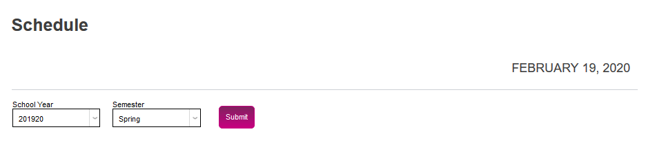
One of the core principles of accessibility is that nothing should happen automatically without a command from the user. Automatic actions can often confuse screen readers, confusing visually impaired users as well. Previously, the dropdown menus in the Jenzabar SONIS user portals were designed to automatically update when a selection was made. These menus were altered to require a button click to submit a selection.
Additionally, the carousel on the SONIS home screen has been updated to no longer continually auto-rotate after its first cycle. Buttons have been added that allow users to pause and resume the initial auto-scroll.

Required Fields
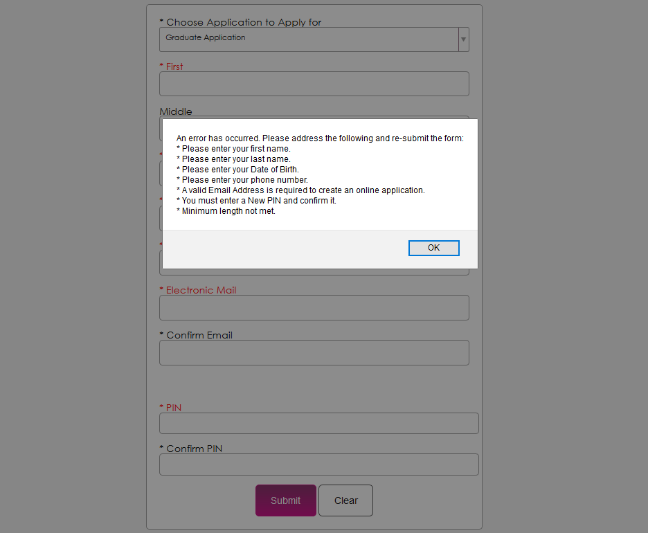
The way many Jenzabar SONIS pages handled required fields was also an issue for accessibility. The fields were not marked as required and submitting a page without entering data into a required field would only create an alert about the first field that was skipped. After the accessibility update: an alert box pops up noting every error, not just the first one; required fields on forms show an asterisk before the name of the field; and input field errors show up in red after a user fails to submit a form. The first field in error receives focus after closing the alert box.
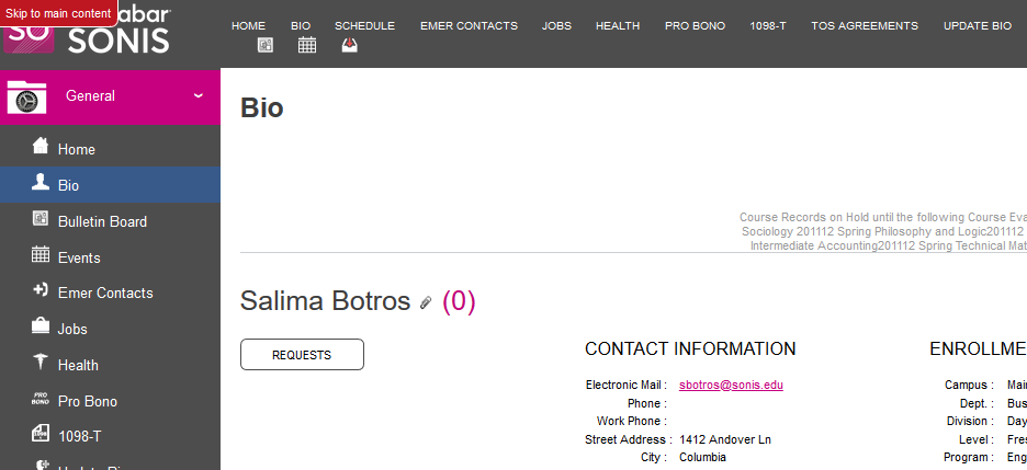
Skip to Content
When accessing a webpage with a keyboard, it can be time-consuming and frustrating to press the tab key repeatedly in order to get to the main content of the page. A Skip to main content. button was added to allow keyboard users to navigate through a page more quickly and easily. The Skip to main content. button is always the first or second focus element on a page. When a new page is loaded, clicking the tab key twice will cause the skip button to appear in the upper left-hand corner. Clicking this button will change focus to the main content of the page immediately.